9th May, 2017
NNUH Ward Refurbishment
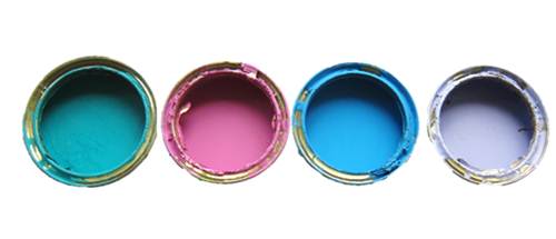
The NNUH wards are refurbished every seven years. As a result, Environmental Arts is working with our own Trust Facilities Department as well as our PFI Directors Octagon and Serco during this process. As part of the current programme we are overhauling the colour schemes to ensure we have the best possible environment for patients affirming the most up to date environment-based research.
This is also an opportunity to correct certain mismatches and have a more integrated hospital wayfinding strategy. This would include things like the placing of notice boards and patient/staff information more clearly around the hospital.
We are therefore looking to approach hospital environments in a manner that is orientated around the key concept of way-finding. This is especially important for older patients, including those with dementia but also those attending stroke wards where way-finding is especially important to help reduce anxiety and confusion that may arise from less sympathetic environments and designs.

(Colours used for Hospital Way-finding)

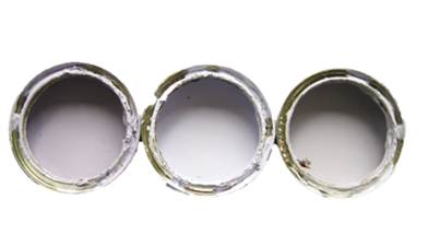
(Colours used for public spaces and corridors)
In choosing our colour schemes, we consulted with our patients and our Dementia Care Team. Their choice of colours and favourites were noted before embarking on the overall plan.
We hope the effect of these colours and strategies will be to enhance patient experience during their stay at the NNUH. It was important to try and create a sense of calm, an attractive as opposed to purely clinical surroundings, and encourage a respectful and reassuring environment overall. Previous research by established bodies indicates that this does noticeably improve patient recovery outcomes.
The needs of having an integrated Environmental Arts approach are many. We try to keep the functionality of the ward clear, whilst at the same time maintaining identifiable notices and points of reference throughout. Things need to be done with simplicity, and we aim never to be confusing and to always provide comfortable surroundings for our patients. The integrated approach must conform to guidelines as advised by the best Dementia Care Practice, the DDA, and the Association for the Blind, NNUH Dementia Care Team, as well as infection control, health and safety, and fire safety requirements.
We aim to streamline the use of colours in this integrated approach, reduce visual clutter and change ward curtains. As part of this, we would like to stop the use of poor quality furniture as well as the mismatch of furniture. Reducing the use of adhoc displays, as well keeping information straight-forward and up to date are clear goals. This all adds to visual clarity and sense of reassurance.
Wards (excluding Mulbarton, Buxton and Cley) show consideration of:
All the wards (excluding Mulbarton, Buxton and Cley) were designed through patient consultation and the top final patient choices were used in the refurbishment. The use of white, natural reflective light was made a priority. The long term goal is to reach a stage of colour-coded furniture. Specific artworks were chosen for the wards after refurbishment and we want to eventually have seating stops on the corridors to allow the patients places to sit and rest. We also plan to design permanent toilet door signage and we are in the future going to make a lottery application in partnership with the Norfolk Museum Service. Individually chosen and personal images for the bedside of a patient is also a key consideration here. Every bed bay is now colour coded with a strong but genuinely calming colour. Each series of side rooms will also be colour coded in this way.
Patient Experience
We are also ensuring that the Day Rooms are personalized and are appropriate to meet the needs of patients attending the ward. We hope also to provide seating areas within the wards so that patients may walk around the wards and find a comfortable place to sit at regular intervals.


