Interior Design Projects
For an overview - click here
Case Study
 |
 |
 |
 |
Design Illusions
The theory behind these illusions can be applied within design to make physical spaces appear very different (larger, smaller, brighter, darker and so on).
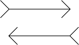
Müller-Lyer Illusion:

The horizontal line segment on the left looks longer than the other one, even though both segments are of the same length.

The bottom horizontal line segment appears to be to the right of the other horizontal segment.
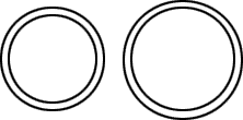
Delboenf's Illusion:

Here we have four circles. The outer circle on the left, and the inner circle on the right are of the same size, but the right one appears larger.
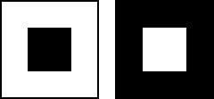
Helmholtz' Irradiation Illusion:

The two figures are of identical size, but the small white square (inside the larger black square) looks larger than the small black square.
Hermann's grid Illusion:

Looking at this grid produces the illusion that there are grey spots or squares at the intersections of the streets or canals.
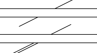
Poggendorff's Illusion:

In the top diagram, the diagonal lines do not appear to line up, but they are the same line. Below that we have the same illusion as it is often shown, with a second segment which seems to line up with the other line on the other side.


